Choosing the right chart for your data
Data Analysis in most scientific papers involves quantitative data, and presentation of numbers to a meaningful chart is an important task. With vast amount of data, the selection of an appropriate chart that interprets the data effectively becomes tough.
The two influential elements for the choice of the right chart for your data are:
- Data Comparison
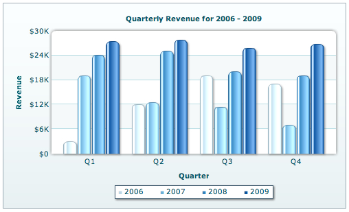
The most common type of chart used for comparison of data is the Bar Graph. For example, the comparison of quarterly sales of a company can be displayed by using multiple series bar graphs. One such graph is displayed below:
Scattered graph or line chart can be used for representing correlation between two variables.
- Data Composition
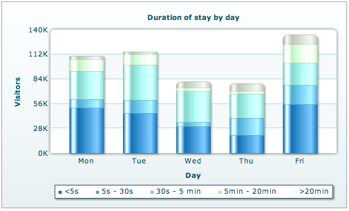
The structure of data is another signifying element. When the data comprises of different categories or is composed of three or more variables, a pie chart or stacked bar graph can be used to interpret data. The stacked chart can be described in the following way:
Choosing the right type of chart for representation of your quantitative data is of utmost importance since a diagrammatic presentation of numerical data is deemed to convey your idea to your readers in exactly the same way.

davidbergevin 1:39 am on May 5, 2014 Permalink |
I’ve also used bar graphs for qualitative data.
Elizabeth B. White 5:16 am on September 29, 2014 Permalink |
I always using prefer graphs/charts